Pramati · Healthcare Workflow

Nurse Allocation

Designing for a problem where getting it wrong affects patient care

3
Distinct planning scenarios, one module
4
Key design decisions with patient safety implications
v1.3
Delivered — showing iteration, not a one-pass solution
Role
Sr. UX Designer
Company
Pramati / LeanTaaS
Scope
Workflow Design + Proposal
Domain
Healthcare · Infusion Centers · Scheduling
Nurse scheduler — Gantt timeline with colour-coded appointment types
The Domain

Infusion centers are high-stakes scheduling environments

An infusion center administers chemotherapy and other intravenous treatments. Each patient appointment can run 3–5 hours or longer. Each nurse can only handle a limited number of patients simultaneously. A session that starts late or runs long has cascading effects on every patient who follows.

iQueue is a SaaS platform built by LeanTaaS that helps hospitals optimise scheduling and resource utilisation. This module extended iQueue's daily huddle concept specifically for nurse-to-patient allocation — where the stakes of getting it wrong are measured in patient outcomes, not just user frustration.

The Problem

Three distinct planning problems — one module had to solve all of them

"Nurse allocation" wasn't a single problem. It was three problems that had to be solved in sequence, by different users, at different times of day.

Evening / Morning before
Who is seeing which patient, and when?
Nurse Manager / Charge Nurse
See each nurse's caseload for the coming day. If a nurse calls out, redistribute that caseload across the remaining team — quickly, without losing track of who's covered.
Before run
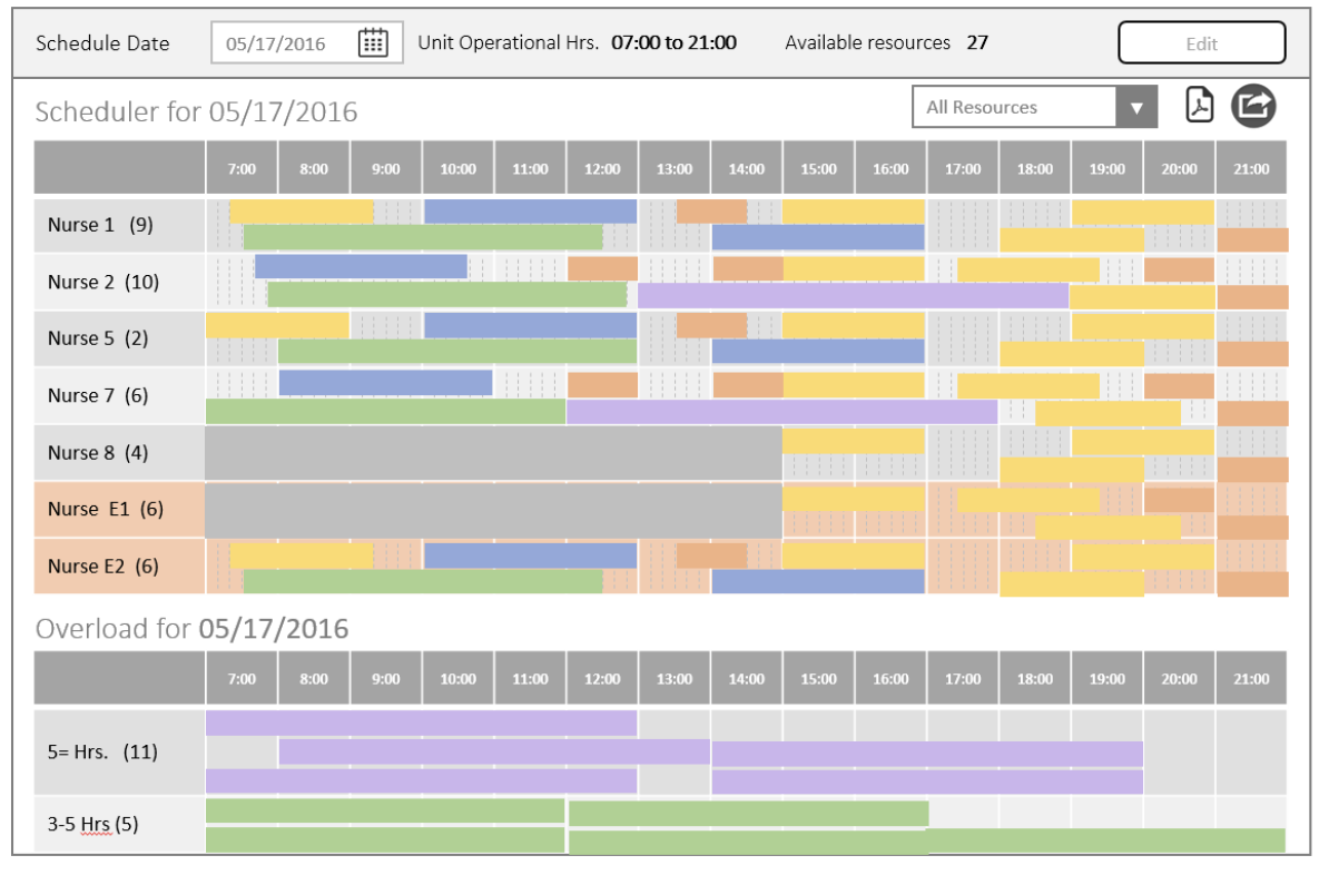
What happens when there aren't enough nurses?
Nurse Manager / Charge Nurse
When scheduled patients outnumber available nurses, the system needs to surface the gap clearly — not hide it. The manager needs to see exactly what's unallocated and make manual decisions to cover it.
Throughout day
Patient arrives — which nurse takes them?
Flow Coordinator / Charge Nurse
As patients check in — including same-day add-ons — a flow coordinator needs to direct each patient to their assigned nurse in real time, without hunting through a list or making phone calls.
Design challenge

The architecture had to support three distinct user states: planning mode the night before, adjustment mode the morning of, and reactive mode throughout the day — without the interface feeling schizophrenic. Every constraint here had a patient safety implication.

Key Design Decisions

The choices that defined the module

01
Make the overload visible, not hidden
When appointments can't be allocated to any nurse, the system adds "dummy nurse" rows to the scheduler — making the gap explicit rather than silently dropping appointments. A manager who can see the problem clearly is a manager who can solve it.
Hiding overload creates false confidence. In a clinical context, false confidence is the precondition for harm.
02
Partial absence as its own state
A nurse unavailable for 90 minutes mid-shift is not the same as a nurse who is absent. I designed partial absence as a distinct interaction — a clock icon with hover tooltip showing the specific unavailable window — rather than a binary available/unavailable toggle.
Precision matters when allocating 3–5 hour treatments around a 90-minute gap. Collapsing it to binary creates over-allocation.
03
Drag appointments, not resources
The Gantt view allows supervisors to drag appointment blocks between nurses to resolve overload. The key distinction: appointments are draggable, not resources. This enforces the correct mental model — you're moving patient assignments to nurses, not moving nurses to appointments.
The framing matches how charge nurses actually think about reallocation, reducing decision errors under time pressure.
04
Predicted vs actual end time as a live mechanism
Infusion durations are uncertain. The scheduler stays accurate throughout the day as supervisors update actual end times — which cascades into better real-time allocation decisions for the rest of the shift. This is a live update mechanism, not a post-day report.
A scheduler based on predicted times becomes unreliable by mid-morning. This kept decisions grounded in reality throughout the day.
Resource availability view — emergency nurses (E1, E2, E3) colour-coded distinctly; partial absence clock icon with time-window tooltip
Impact

A module that made the invisible legible

Product
  • Three distinct planning scenarios addressed in one cohesive module
  • Overload made explicitly visible — no silent failures or hidden gaps
  • Partial absence tracked as a distinct state from full unavailability
Operations
  • Daily plan shareable to individual nurses — closing the planning-to-awareness loop
  • Real-time end time updates kept the scheduler accurate throughout the day
  • Emergency resource addition surfaced clearly through visual differentiation
Approach
  • Proposal-stage design that shaped product scope, not just interaction
  • Healthcare constraint-awareness embedded in every decision
  • Delivered to v1.3 — iteration and refinement, not a one-pass solution
Reflection

Surface the complexity. Trust the clinician.

Most enterprise UX problems, when you get them wrong, create friction or inefficiency. When you get a healthcare scheduling tool wrong, the consequence lands on a patient. That understanding changed how I approached every decision in this project.

The principle this project crystallised

Automation should handle distribution. Humans should handle exceptions. A tool that hides its own limitations creates false confidence. A tool that surfaces them clearly creates the conditions for good decisions. In healthcare, that distinction matters more than anywhere else I've worked.

← Previous Recruitment Dashboard · Darwinbox Next → Uplifting the Expense Experience · Darwinbox