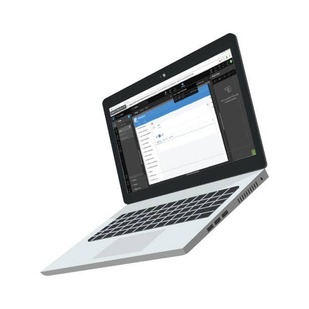
Pramati · Low-code Platform
RAD platform redesign
Turning a capable product into one people actually wanted to use
A low-code platform with genuine technical depth was losing users before they ever saw its value. I led the end-to-end experience transformation — website to product — that changed that.
Before
2%
Conversion rate — paused across the full funnel
Before
41%
Drop-off at step 6 of 14 — before a single build
Before
1,968
Trial users who never reached a paid-ready state
The real problem
This wasn't a feature problem. It had quietly become a business problem.
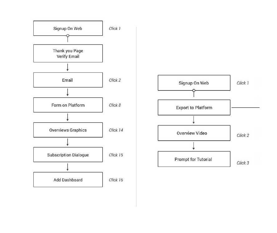
Of 2,400 trial users, only 18% activated within 7 days. The onboarding flow had 14 steps — and 41% of users dropped off at step 6, before they'd built a single thing. The product itself was genuinely good. But good product hidden behind a broken experience is commercially the same as a bad product.
Analytics pointed at friction. Heuristic reviews flagged obvious problems. But the numbers alone couldn't explain why users were arriving already disoriented — before they'd touched a single feature. That required a different kind of investigation.
Research & Discovery
Three methods. One reframe.
The problem wasn't obvious from the surface. Analytics showed where people were leaving. Usability testing showed why. Journey mapping showed the failure was happening before users ever reached the product — and that the fix required a fundamentally different scope.
Analytics Audit
What the numbers showed
35%
of signups never entered the platform at all
15
clicks before reaching the App Dashboard to create a project
2%
conversion rate across the full funnel — barely moving
The funnel showed where people stopped. It said nothing about why they arrived with the wrong expectations before they even got there.
Usability Testing
What sessions revealed
- Users struggled to locate resources — visibility was low across every key area of the product
- Information grouping didn't match how users thought about their work — the IA was organised around system logic, not task intent
- The canvas felt intimidating — everything visible at once, no clear starting point, no sense of where to begin
- The website spoke developer language — budget holders couldn't see business value in the first three minutes
Users weren't failing the product. The product was failing to meet users where they were — in mindset, not just in interface.
Journey Mapping
What the maps exposed
- Three personas entering the same funnel — each with a different motivation, and a completely different failure mode
- Touchpoints overlapped but the message needed to be different — one strategy was failing two of the three personas entirely
- The CXO evaluated ROI the website didn't offer. The developer was blocked by 15 clicks before touching the canvas. The evaluator had no fast path to technical confidence.
Journey mapping revealed this wasn't a conversion problem inside the product — it was a positioning problem that started before users ever signed up.
The research reframe
The drop-off wasn't a product usability problem. It was a first-impression problem — compounded across every surface a user encountered before they ever built anything.
This reframe is what changed the scope from UI improvement to an end-to-end transformation: website, onboarding, product, and post-trial — not as separate projects, but as a connected system where each surface played a role in getting the right user to the right value at the right moment.
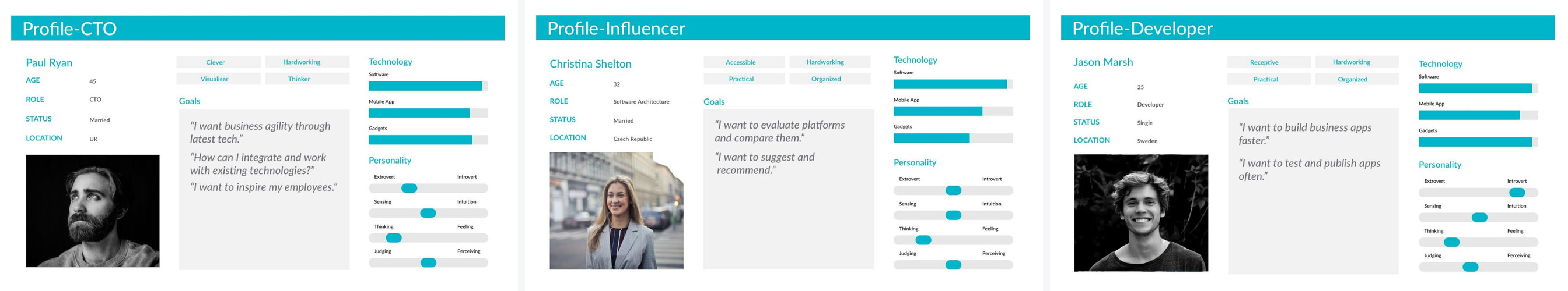
Personas
Three entry points — each with a different failure mode
The research pointed to three distinct users entering the same funnel with completely different needs. Mapping each one made the divergence impossible to ignore — the product was working for one persona and systematically failing the other two.
CXO · Decision maker
Business buyer
What they needed
Business value, fast. ROI visible in the first 3 minutes. No patience for documentation or technical setup language.
What they were getting
A developer-first website with API references, technical depth, and no language that spoke to business agility or commercial outcomes.
Architect · Influencer
Technical evaluator
What they needed
Rapid proof of technical depth. Enough confidence to recommend up the chain without a full POC. Clear differentiation from alternatives.
What they were getting
A product that required significant time investment before depth was visible. The evaluation cost was too high for an early-stage recommendation.
Developer · Builder
Hands-on user
What they needed
Frictionless access to the canvas. Build fast, customise, ship. Nothing between them and the first successful deployment.
What they were getting
14 steps before they could touch anything meaningful. A blank canvas, no guidance, 41% chance of abandoning before building a single thing.
Strategic decisions
Five decisions — this is where the seniority lives
The most important design decisions on this project weren't visual. They were about what to deprioritise, what to reframe, and whose questions to answer first. Each required alignment across product, engineering, and commercial stakeholders.
01
Prioritise speed-to-value over data collection
The strategic logic
The existing signup flow asked a lot before letting users in. I flipped the priority: get users to their first success as fast as possible, then ask for context. People commit to things they've already experienced as valuable — not things they've been asked to describe in advance.
Before
11.4 min
to first success — account setup and API keys first
After
6.2 min
to first success — highest-friction steps deferred post-value
02
Tutorial-first first-time user experience
The strategic logic
New users arrived at a blank canvas with no clear starting point. I designed a guided onboarding path — showing what an app is, walking them through creating one, celebrating the moment they saw it work. The goal wasn't hand-holding. It was building enough early confidence that users kept going independently.
03
Rebuild the IA around user mental models, not system logic
The strategic logic
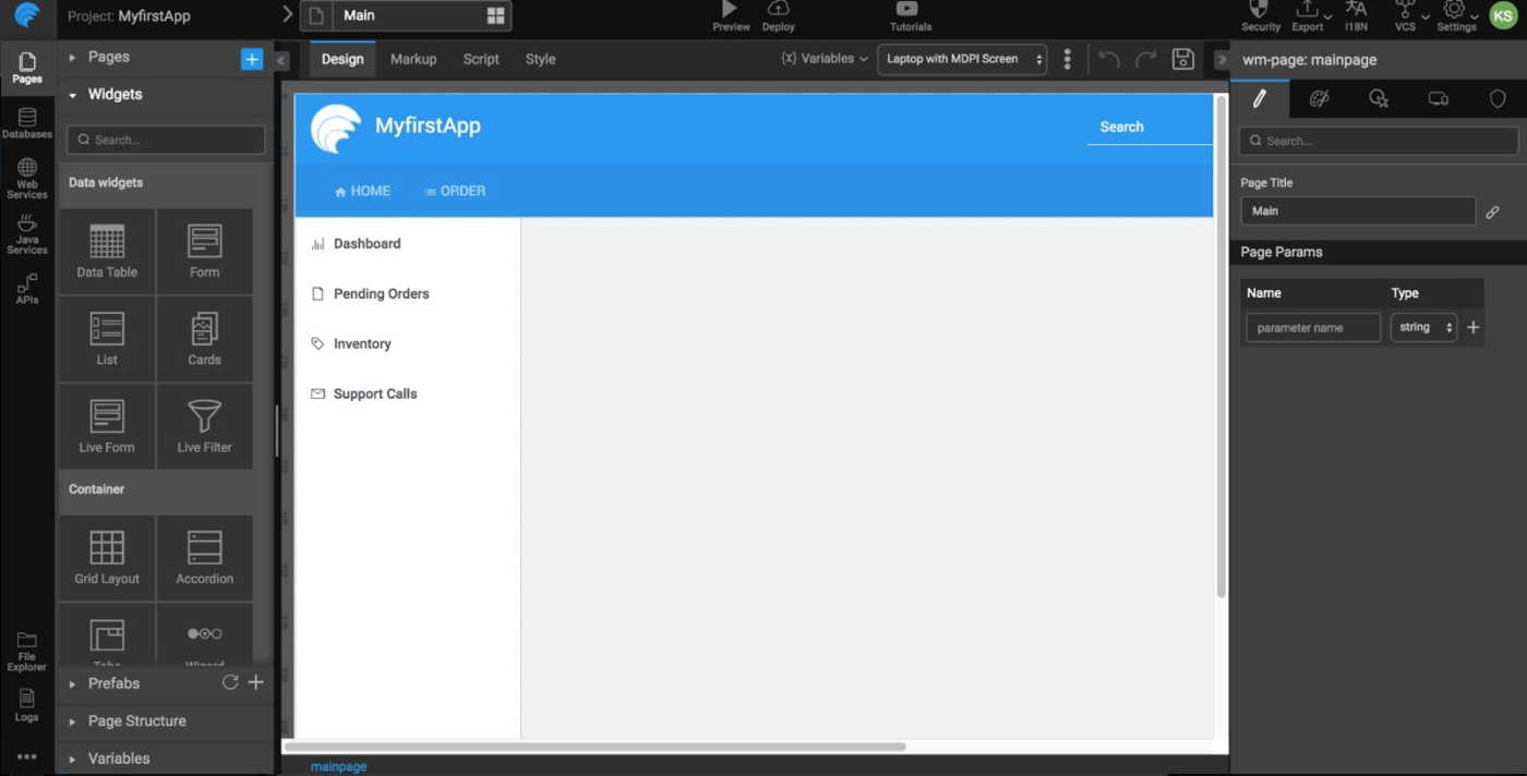
The existing structure was organised around how the product was built internally. I redesigned the IA to align with user mental models — grouping by task intent, surfacing high-need resources upfront, building navigation consistent across all workspace views. The architecture stopped making sense to engineers and started making sense to users.
04
Simplify the canvas — visibility over feature density
The strategic logic
The studio interface showed everything at once. Powerful for experts, overwhelming for anyone new. I reduced what was visible at first glance and surfaced contextual actions only when relevant. The feature set didn't shrink — the cognitive load did.
05
Design for the full lifecycle, not just the entry point
The strategic logic
I extended scope to include a lead nurturing strategy. A CXO who signed up but didn't convert needed a completely different post-trial experience than a developer who got stuck at step 3. Designing only for first-time use was designing for half the problem.
Scope of the transformation
End-to-end — not a phrase, a commitment
The transformation touched every surface a user encountered — not as separate projects, but as a connected system where each surface played a role in a single journey.
01
Website
Repositioned for CXO and Architect — business value first, technical depth for those who need it
02
Onboarding
14 steps → guided FTUX. Speed-to-value over data collection. First success in 6.2 min
03
Product
IA rebuilt around task intent. Canvas simplified. Navigation consistent across all workspace views
04
Post-trial
Persona-segmented lead nurturing — CXO path and Developer path designed separately
Impact
Product outcomes, business outcomes, and one that stands above the rest
Product
Time-to-first-success: 11.4 → 6.2 min
Reduced onboarding steps and cognitive friction
IA aligned with user mental models across all views
Launchpad and RBAC added to product roadmap — direct consequences of enterprise buyer feedback surfaced through UX
Business
Increased activation across funnel stages
Improved early engagement and retention signals
Platform repositioned from low-conversion product to enterprise-ready — referenced in active enterprise sales conversations
Strategic
Design positioned as strategic function, not delivery service
Research findings adopted as product strategy
#1 company priority for 2 consecutive quarters
#1
Company priority · 2 consecutive quarters
Not a design award — a business mandate. This work was the single highest-priority initiative at Pramati for two consecutive quarters, measured, tracked, and referenced at the executive level.
Reflection
What this required as a leader
I'd start the CXO/influencer persona framework in week one, not week six. The first two months were spent optimising within the existing frame before usability testing exposed the deeper misalignment. The data was always going to say the same thing — we just hadn't looked for it yet. That's a lesson in research sequencing: strategic questions need to be asked before tactical ones.
What this required as a leader
Solving something at this scale required holding two things at once: the patience to build trust through small wins, and the conviction to push for the bigger transformation when the evidence was clear. You can't get to the reframe without the early credibility. But you can't stop at the early wins when the evidence points to something deeper.
The most important design decisions on this project weren't visual. They were about what to deprioritise, what to reframe, and whose questions to answer first. The design output was the evidence of those decisions — not the decisions themselves.