Proterra · IoT Leadership

Clarity as a Design Deliverable

Bringing order to a system that nobody fully understood yet

260
Devices managed across the MDC dashboard
4
Status states — designed for uncertainty, not binary on/off
2
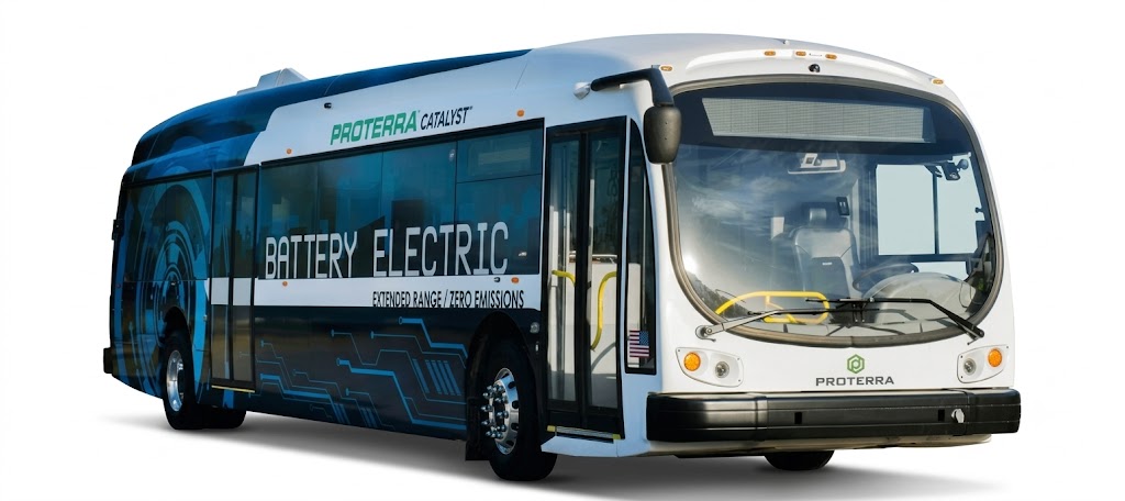
Products — Transit platform + MDC controller
Role
Design Lead
Company
Innominds for Proterra
Scope
Transit control + MDC platform
Domain
IoT · EV Infrastructure · Distributed Systems
../assets/proterra-hero.png
MDC exception-first dashboard — 260 devices across 4 status states (Charging/Faulted/Offline/Booting) with colour-coded status bar
Proterra MDC dashboard — 260 devices, 4 status states, colour-coded status bar
The Challenge

The hardest problems weren't design problems — they were clarity problems

Proterra's MDC platform managed distributed EV charging infrastructure via IoT and cloud. Requirements were ambiguous, stakeholders were misaligned, and engineers who would use it daily had no mental model of how it all connected. Before any visual design, I had to treat the ambiguity itself as the first design problem to solve.

Stakeholder
Conflicting priorities, no shared definition of done
Different stakeholders had different assumptions about what the system should show, what actions it should allow, and what "control" even meant in a distributed IoT network.
Requirements
Evolving scope in a technically complex domain
What looked like a product decision on day one was often a systems capability question that needed engineering input before a design direction made sense.
User
Engineers without a usable mental model
Technically expert engineers — but the existing workflows didn't match how they actually operated. The system's logic was opaque. Obvious decisions required navigating through several layers of state and interface.
System
Real-time IoT with inherent unpredictability
Distributed dispensers across multiple locations. Real-time status that changes without user action. Commands that may not execute immediately or at all. The UX had to account for states on a spectrum between "working," "uncertain," and "failed."
The turning point

Clarity is a design deliverable — not a prerequisite for design. The documents, frameworks, and shared principles produced during stakeholder alignment were as consequential as any wireframe that followed. Anyone can produce screens. Not everyone can take a technically complex, stakeholder-conflicted product and bring it to a point where the right design becomes obvious.

Key Decisions

The choices that defined the product

01
Surface alerts before all-device status
Completeness vs relevance — relevance wins.
Stakeholders wanted engineers to "see everything." But engineers didn't want to see everything — they wanted to know what was wrong. The MDC dashboard led with a single-row status bar showing all 260 devices across four states, colour-coded and immediately scannable. Faulted devices visually distinct before any interaction.
02
Design for uncertain states, not binary states
Four states: Charging, Faulted, Offline, Booting.
IoT systems don't have clean on/off states. A dispenser might be "connecting," "unresponsive," or "last seen 4 minutes ago." Every status indicator was designed to communicate confidence level, not just current value — because in a distributed system, "unknown" is a valid and important state.
03
Constrain controls to what the system can reliably execute
Fewer actions, each clearly scoped to guaranteed capabilities.
Stakeholders initially wanted broad remote control — start sessions, override states, force resets. Engineering flagged that many commands were unreliable over the IoT layer. Rather than showing controls that might silently fail, I advocated for a narrower, more honest control set. Trust in a monitoring tool depends on it not lying to you.
../assets/proterra-dashboard.png
MDC device detail view — configuration parameters, firmware version, security certificates, and 6 app packages in a single scrollable view
Impact & Reflection

Clarity delivered as a product

Product
  • Task-centric IA replaced system-centric navigation
  • Uncertain states designed explicitly — engineers trust the display
  • Control set constrained to reliably executable actions
Engineering UX
  • Engineers identify and act on network issues without navigating the full device hierarchy
  • Real-time status model aligned with how IoT systems actually behave
  • Reduced cognitive overhead in high-attention operational workflows
Process
  • Stakeholder alignment delivered before first wireframe — fewer late-stage direction changes
  • Design principles documented — decisions in later sprints had shared grounding
  • Demonstrated that design leadership in complex domains starts before the visual work
The leadership principle this project confirmed

In complex systems, the designer's most valuable contribution isn't the design — it's the clarity. In a domain like IoT infrastructure, a designer who doesn't understand the system's actual behaviour will produce interfaces that look reasonable but fail operationally. Building enough technical understanding to design honestly, not just visually, is what separated this work from a surface-level redesign.

← Previous Uplifting the Expense Experience · Darwinbox Next → Clinical Safety Dashboard · Lenexa