LenexaCARE · Clinical UX

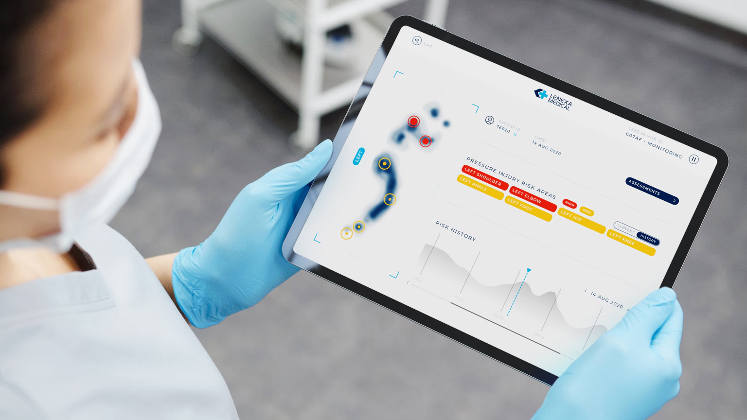
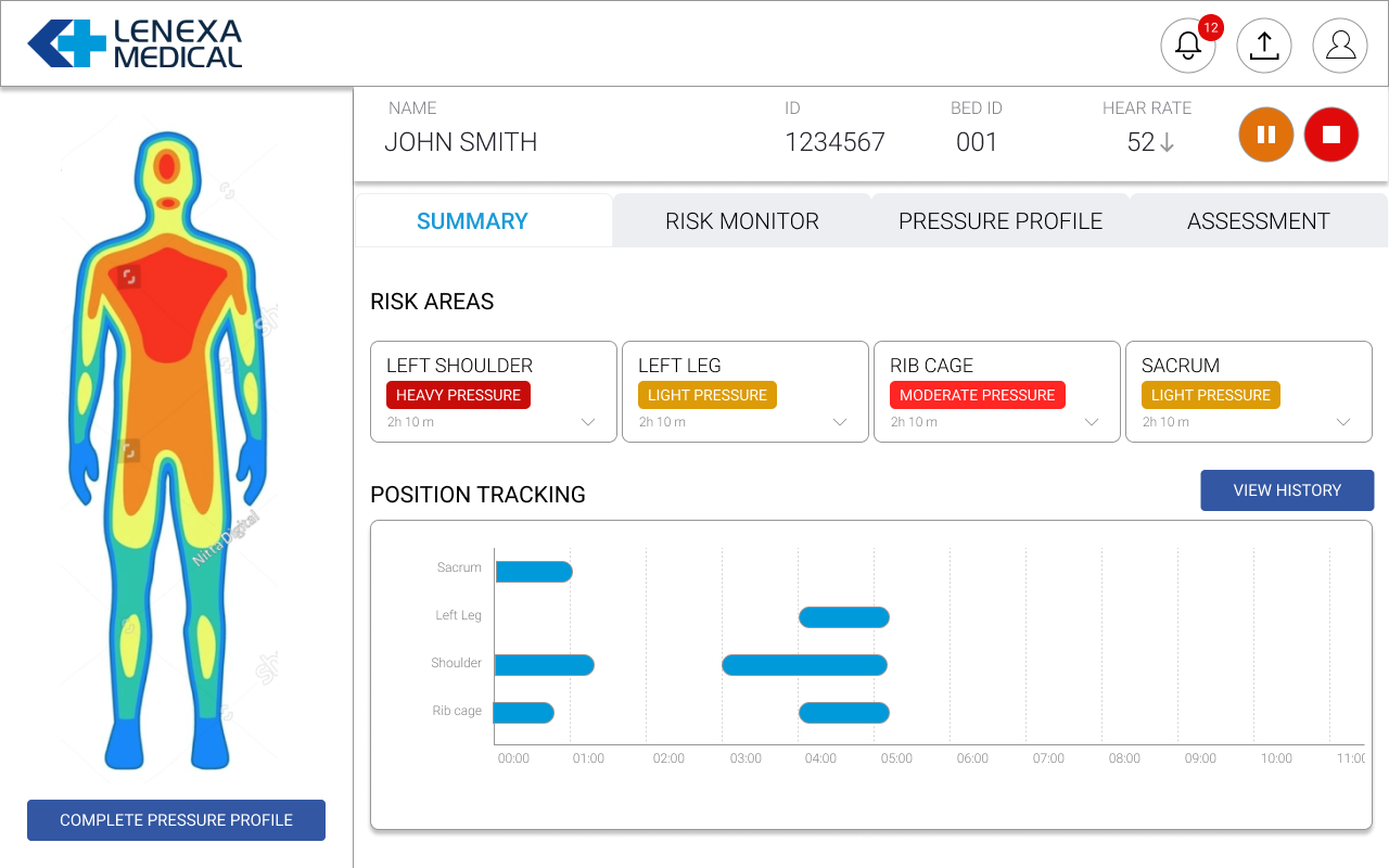
Clinical Safety Dashboard

Designing a clinical dashboard where the data isn't just useful — it prevents harm

80–95%
Of pressure injuries are preventable — with timely intervention
$9B+
Annual cost to Australian healthcare system alone
Higher mortality for patients who develop injuries in hospital
Role
Visual + Interaction Designer
Company
Lenexa Medical
Scope
Clinical Desktop Dashboard
Domain
Healthcare · Pressure Care · Patient Monitoring
../assets/lenexa-hero.png
LenexaCARE clinical monitoring dashboard — body map panel, risk cards, and 4-tab navigation
LenexaCARE clinical monitoring dashboard
The Domain

A preventable problem that healthcare has struggled to solve

Pressure injuries develop when sustained pressure restricts blood flow to vulnerable tissue — affecting patients who are less mobile, spend extended time in bed, and depend on clinical staff to reposition them before damage sets in. Lenexa Medical's LenexaCARE system addresses this with sensor technology embedded in a smart patient mat. My job was to design the clinical dashboard that turns that sensor data into something a clinician can act on — quickly, accurately, and without ambiguity.

Critical context

In safety-critical clinical UX, an interface that delays a decision or obscures a risk signal doesn't just create friction — it contributes to a preventable harm. That understanding shaped every design decision in this dashboard. The goal is not to keep a clinician on the screen longer. It is to get them the information they need as fast as possible and send them back to the patient.

What I Designed

A four-module clinical monitoring system — with one constant

The dashboard was structured around a persistent left-panel body map and four-tab navigation, each tab serving a distinct clinical need. The body diagram — always visible regardless of active tab — was the anchor of the entire experience. A clinician looking at any view always had spatial context: which area of the body, which position, which lobe.

Dashboard
At-a-glance risk summary
Risk cards showing current severity, position tracking timeline, and quick access to detailed history across body areas.
Risk Monitor
Detailed risk per body area
Risk level as a percentage progress bar, risk area classification, contextual details, and trend indicators per region.
Pressure Profile
Full pressure distribution history
Sensor data over time, accessible via a time-series chart spanning the full monitoring period — not just a current snapshot.
Assessment
Clinical records & documentation
Bridging real-time monitoring with the structured clinical record — linking what the sensor sees to what clinicians document.
Clinical monitoring dashboard — persistent body map left panel, risk cards, 4-tab navigation, and 12-hour position tracking timeline
Key Design Decisions

What informed the choices

01
Body map persistent across all tabs
Clinical staff think in anatomy, not data fields. Keeping the body diagram visible regardless of active tab meant the spatial context — where on the patient the risk exists — was never lost during navigation.
Prevented the cognitive switch between data view and anatomical reference that forces clinicians to mentally translate a number into a body location.
02
Position tracking as a time-series, not a snapshot
A single pressure reading tells you where the patient is now. A time-series chart tells you how long they've been there — which is the clinically meaningful variable. The 12-hour chart made overdue repositioning visible at a glance without calculating elapsed time manually.
Duration of pressure, not just current pressure level, is the variable that predicts injury development.
03
Risk level as percentage + progress bar, not colour alone
Colour-only risk indicators fail for colour-blind users and in high-ambient-light clinical environments. The Risk Monitor combined a percentage figure, a labelled progress bar, and contextual text — three independent channels communicating the same information.
No single rendering failure should be able to leave a clinician without the risk signal they need.
04
Patient header always visible
Patient identity, age, bed ID, and heart rate were fixed in a persistent header across all tabs. In a busy clinical environment with multiple screens and patients, mistaken identity is a real risk. Every reading was always unambiguously attributed to the correct patient.
Identity errors in clinical decision-making are not UX problems. They are patient safety events.
Impact & Reflection

Sensor data made clinically actionable

Product
  • Four-module dashboard covering real-time monitoring through historical assessment
  • Body map persistent across all tabs — spatial context never lost
  • Position tracking timeline made overdue repositioning visible without manual calculation
Clinical UX
  • Multi-channel risk communication (%, bar, text) accessible across display conditions
  • Persistent patient header reduced patient identity confusion risk
  • Alert system surfaced actionable signals from passive sensor monitoring
Domain
  • Translated raw sensor data into clinically meaningful, intervention-ready information
  • Design aligned with how clinicians think spatially — anatomy first, data second
  • Supported Lenexa's positioning as a trusted partner for hospitals and aged care globally
What designing for clinical safety demands

Restraint is not a stylistic choice in safety-critical design — it is a clinical requirement. A simpler, clearer dashboard doesn't just look better. It is better, because the moment between a clinician seeing a risk signal and acting on it is the moment the design either earns its place or doesn't. Every second a clinician spends interpreting a chart rather than understanding it is a second the design has failed.

← Previous Clarity as a Design Deliverable · Proterra Next → Warranty Platform · AmaraRaja