FlyDubai · Research Case Study
What 36 users knew that the team didn't
When assumptions meet real users, the design always changes
I led a full-scale moderated usability study for the Holidays by flydubai booking platform — 36 participants, 7 tasks, 3 persona segments, 4 days of testing. What we found reshaped the product's core booking flow from the ground up.
75%
Error rate on room modification — the study's critical failure point
36
Moderated sessions over 4 days, 50 min average each
15+
Nationalities — matched to flydubai's international customer base
Context
A new holiday booking platform about to launch — and nobody had watched a real user try to use it
Holidays by flydubai was preparing to launch a full holiday booking product — not just flights, but packages combining flights, hotels, room selection, excursions, and in-flight add-ons into a single end-to-end booking flow. Complex by nature. High-stakes for users making real financial decisions.
The design team had built something visually polished. But polished surfaces can hide deep usability problems. My job was to find them before real users did — and turn what I found into clear, prioritised direction for the product team.
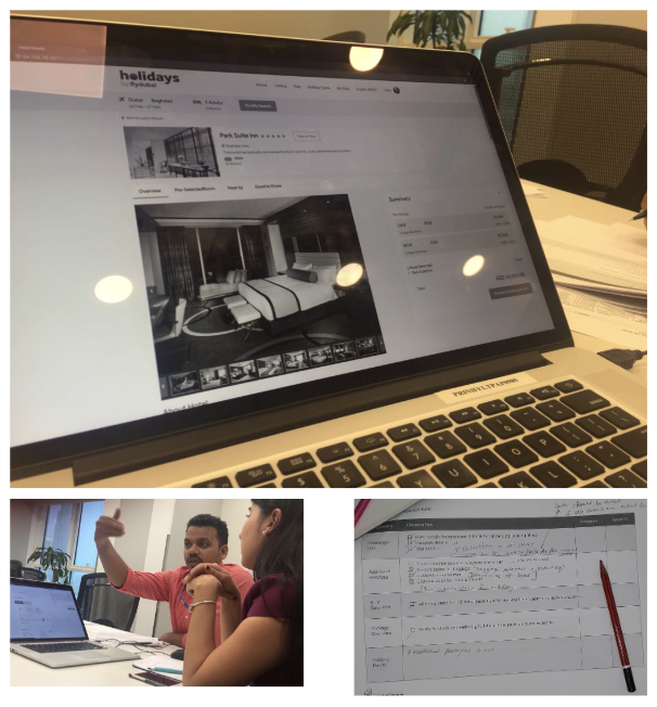
I was accountable for this study end-to-end: study design, participant recruitment, session facilitation, data analysis, and the final report with recommendations. I co-led Team 1 in parallel with Team 2, running sessions simultaneously across four days to test at scale within a tight pre-launch window.
Study Design
Setting up a test that would actually tell us something useful
I chose a moderated think-aloud protocol — not unmoderated remote testing, not a survey. A holiday booking flow is complex and multi-step. We needed to understand not just where users failed, but what they were thinking and expecting in the moments before they failed.
01
Recruitment
36 participants · 15+ nationalities · 3 persona segments
02
Scenario Design
3 tailored scenarios · 7 tasks per critical funnel step
03
Sessions
4 days · 50 min avg · think-aloud + audio recording
04
Analysis
Task completion rates · error rates · post-task questionnaire
05
Recommendations
Severity-rated findings · product-ready report · <3 weeks
I recruited across nationalities, professions, and travel experience levels — South African, Scottish, Kenyan, Egyptian, Jordanian, Portuguese, British, Indian, Filipino, Russian, Hungarian, and more. flydubai serves a diverse international customer base. A test run only with Indian participants in Dubai would have been locally convenient but analytically misleading.
Participants
Who we tested with — and why it mattered
The three segments reflected fundamentally different mental models coming into the booking flow — not just demographic differences. A single-segment test would have hidden the fact that some features worked well for one persona and actively failed another. The divergent results were the finding.
Persona 1
Self-directed
6 participants
Already knows what they want. Comes to book, not to browse. Moved fast, made assumptions, didn't ask for help — which exposed different failure modes than the other segments.
Persona 2
Semi-guided
14 participants (largest segment)
Has some idea of destination or budget but needs options to compare. The most important segment to design for — needs both structure and flexibility.
Persona 3
Discovery mode
10 participants
No destination, no dates, open to inspiration. Needs the product to be a guide, not just a booking engine. Most likely to abandon if the early experience doesn't hook them.
What the Data Showed
The data told a clear story — once we knew where to look
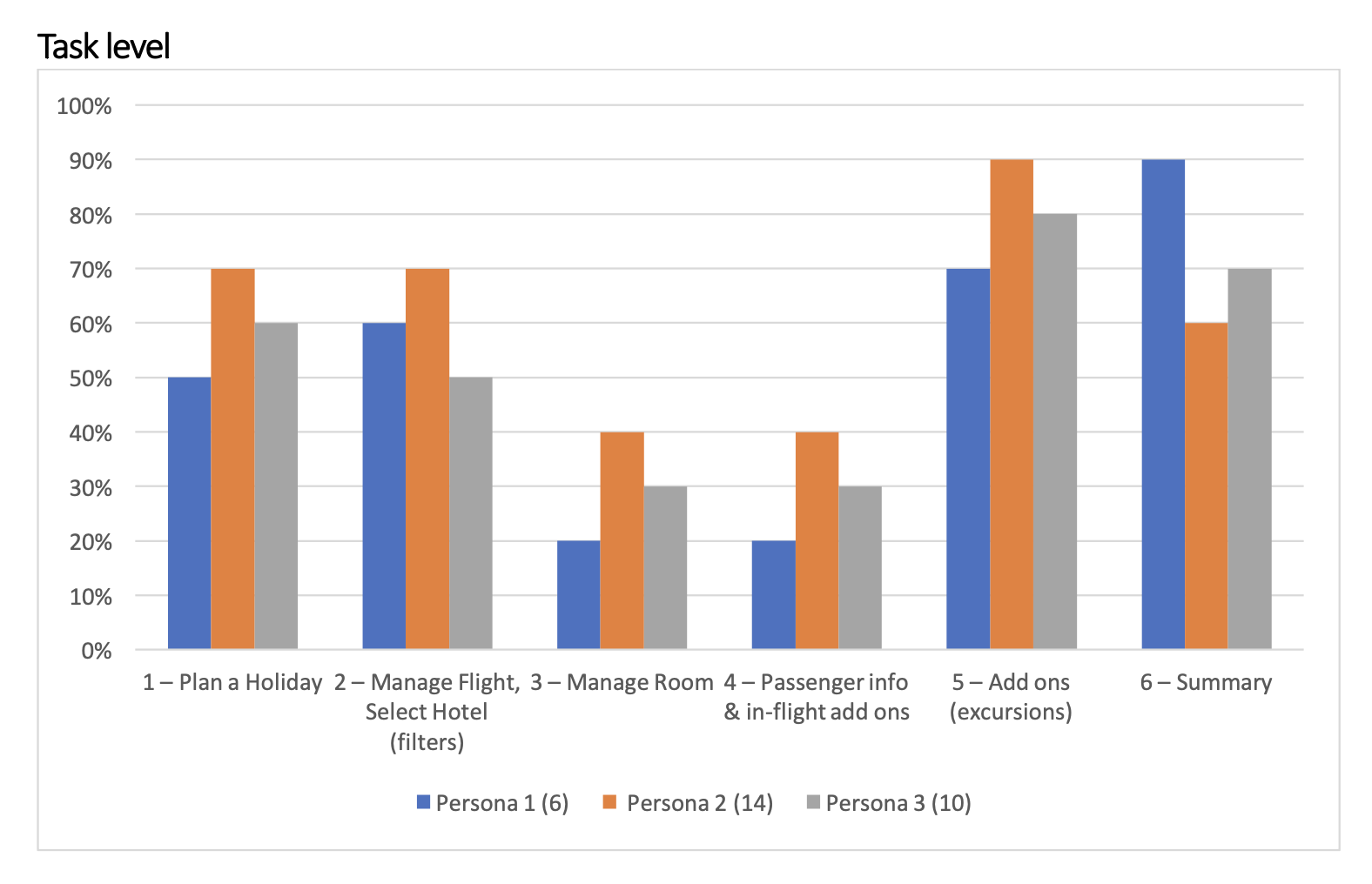
Task completion rates by persona · UT Report p.7
Package concept invisible
Users didn't understand they were booking a package. The "Flight + Hotel" distinction was unclear from search onward. Mental model fractured before room selection.
Room modification — 75% error rate
Couldn't locate room change options, add rooms, or allocate them to passengers. The interaction model assumed expertise users didn't have.
Flow sequence broken
Passenger info appeared after hotel selection — felt like a system error. Users expected all flight steps grouped. Product logic imposed on the user's mental model.
Hotel cards — wrong pricing
Price shown was interpreted as hotel room price, not package price. Created sticker-shock later in the flow and eroded trust.
Flight add-ons missed by majority
Most participants missed inbound and outbound add-ons entirely. A financially significant step was being skipped without users knowing.
Offers section
Designed for Persona 3, attracted everyone. Gave users permission to dream before committing to a search.
Geolocation — "Explore world from"
Genuine positive reactions across all segments. Users grasped the personalisation angle immediately. Strong — but buried.
Seat selection
Consistently praised. Moving seat selection forward felt like a genuine gift. Small detail, outsized emotional impact.
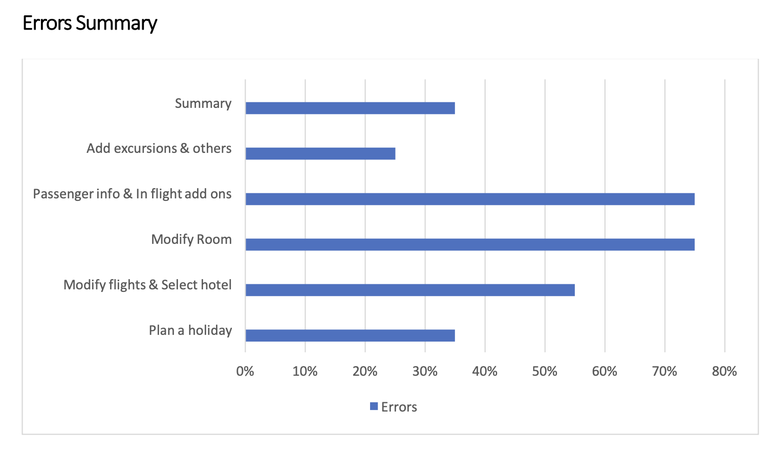
Error rates per task · UT Report p.8
Direct from Participants
The most useful data is often what people say out loud
Think-aloud sessions generate something no analytics dashboard ever will: the unfiltered moment of confusion, the exact point where a user decides to push through or give up. Each quote maps directly to a structural failure in the flow.
Persona 3 · Discovery phase
Home page is giving me all the information needed, but the long scroll is a pain.
Content value confirmed — but navigation fatigue is real
Persona 2 · Booking flow
The step indicator should tell me how far I am from my target, but it's appearing somewhere in the middle of the flow.
Progress anxiety — no sense of where they were
Persona 2 · Mid-flow
Passenger info after hotel selection is a surprise. I wish I could do all flight-related activities in one place.
Mental model expected grouped steps, not scattered
Persona 1 · Hotel / Room step
First of all, I don't have any clue that I am selecting a hotel. Room modification or selection is too complex.
The product's worst moment — confirmed across all segments
Finding → Design Action
Three critical failures, three structural interventions
The three most severe findings each required not a UI patch but a structural rethink. Here is the direct evidence-to-recommendation chain.
Finding · Critical
75% error rate on room modification
Couldn't locate room change options, add rooms, or allocate rooms to passengers. Lowest completion rate of any task.
Design Action
Completely rebuild room selection
Visible room categories. Obvious path to add rooms. Explicit passenger-to-room allocation. Room add-ons surfaced, not hidden.
Finding · Critical
Package concept invisible from search
Users didn't understand they were building a package. "Flight + Hotel" vs "Flight only" distinction was unclear from the first screen.
Design Action
Frame the experience as "building a holiday"
Separate Destination and Theme inputs. Package-oriented language and IA from the first interaction.
Finding · Critical
Flow sequence broken — felt like a system error
Passenger info appeared after hotel selection. Most participants read this as a bug.
Design Action
Restructure flow around user mental model
Search → Flights (passenger + add-ons) → Hotel (room + add-ons) → Excursions → Summary → Payment.
Participants view on booking a holiday
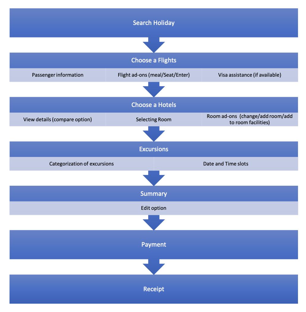
Participant-validated booking flow · UT Report p.16
Recommendations
Eight high-severity recommendations, each tied directly to evidence
Every recommendation was tied directly to an observed failure — not a heuristic judgment. Delivered with clear justifications to the IA and development teams, rated by impact: HIGH = blocking user success at critical funnel points. MEDIUM = significant friction but recoverable. LOW = quality-of-life improvements that matter post-launch.
01
HIGH
Restructure the booking flow around user mental models
Users expected: Search → Flights (passenger info + add-ons) → Hotel (room selection + add-ons) → Excursions → Summary → Payment. Realigning the sequence resolves the majority of critical failures observed.
02
HIGH
Make the package concept explicit from the search bar onward
Separate Destination and Theme inputs, make room and passenger inputs package-oriented, and frame the experience as "building a holiday" from the very first interaction.
03
HIGH
Completely redesign the room selection experience
75% error rate is a flow-breaking failure. Users needed clearly visible room categories, an obvious path to add rooms, passenger-to-room allocation, and room add-ons surfaced.
04
HIGH
Show package pricing, not hotel pricing, on listing cards
Users consistently interpreted the price on hotel cards as the hotel room price. Label as package total, recalculate dynamically as selections change.
05
HIGH
Surface inbound and outbound flight add-ons clearly and separately
Most participants missed in-flight add-on options for both legs. Avoid page-scroll and clearly distinguish inbound from outbound selections.
06
MEDIUM
Add step progress indicator throughout the booking flow
A persistent, accurate step indicator appearing from the start — not partway through — would reduce anxiety and improve completion, especially for Persona 2 and 3.
07
MEDIUM
Add comparison capability for hotels and excursions
Users consistently wanted to compare before committing. Repeated back-and-forth navigation increased cognitive load. Even 2–3 hotels side by side would address observed behaviour.
08
LOW
Add edit capability in the booking summary
Users expected to review and correct before payment. Edit access for passenger names, duplicate add-ons, and room selections at the summary stage reduces final-step abandonment.
What Changed
From test findings to product decisions
Research Output
36 sessions analysed into a structured, severity-rated report
8 high-severity recommendations with justifications delivered to IA and dev teams
User-defined ideal booking flow handed to the IA team
Design Impact
Booking flow restructured to match participant-validated sequence
Room selection interaction completely redesigned
Package pricing surfaced clearly throughout the funnel
Organisation Impact
Findings directly influenced pre-launch product decisions
Full synthesis report completed in under 3 weeks
Established research-before-launch as standard team practice
Post-task sentiment
Post-task questionnaires told the full story: 20 participants liked the concept. 15 strongly felt it needed improvement. That split wasn't a failure — it was the brief. The concept had real appeal. The execution had real barriers. This study gave the team the evidence to close that gap before launch.
Reflection
What this study taught me about research at scale
Running 36 moderated sessions over four days with a diverse, international participant pool is a logistical challenge as much as a research one. The coordination overhead — parallel teams, scheduling, no-show management, consistent protocol across facilitators — is real and often underestimated.
What I'd do differently: build a more explicit affinity mapping session between days 2 and 3, when patterns were starting to emerge but we were still mid-collection. Early patterns were already pointing clearly at the room modification problem. Catching that in real-time and probing deeper in subsequent sessions would have produced richer insight on the most critical failure point.
The central lesson of research
The room modification task had a 75% error rate — not because users were inexperienced or careless. We tested across 15 nationalities and a wide range of travel experience. They failed because the product had been designed around what made sense to the team building it, not what made sense to someone booking a family holiday.
That's the central lesson of well-run usability research: you don't test to validate what you've built. You test because you genuinely don't know what real users will do, and being wrong early is infinitely better than being wrong after launch.
My sociology background shaped how I ran these sessions. I wasn't just watching for task failures — I was watching for the social and cognitive patterns that explained them. Why did Persona 1 fail at room modification when Persona 2 had slightly higher success? Because Persona 1 moved faster, made assumptions, and didn't ask for help. That behavioural insight changed how I wrote the recommendations.