Designing the standard
One table component. Thirty modules standardised. A process that became the template for every component built after.
Tables were everywhere in Darwinbox — and every one was different. I initiated and led the standardisation of table interactions across 30+ modules, reducing duplicate implementation effort, accelerating future product delivery, and establishing the replication model for design system components that followed.
Inconsistency at scale has a cost — it just hides well
Darwinbox had grown into one of India's fastest-scaling enterprise HR platforms — 30+ modules, spanning the full employee lifecycle from recruitment to payroll to performance. At that scale, complexity is inevitable. The question isn't whether inconsistencies exist. It's whether you catch them before they start to cost you.
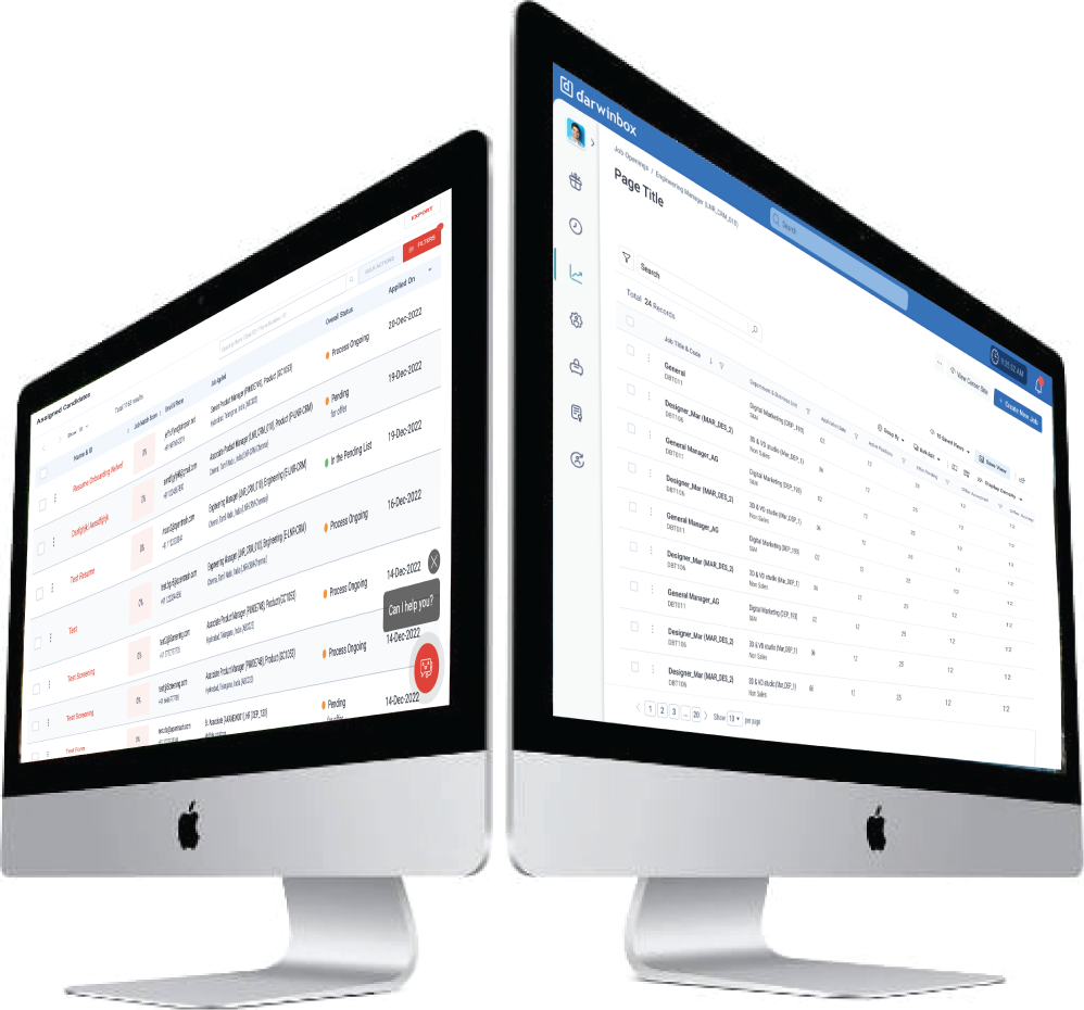
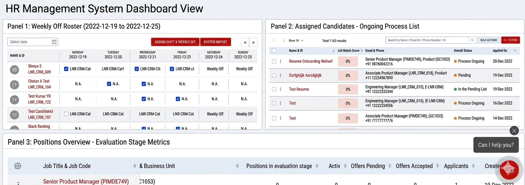
Tables were where the cost was showing. Each module had built its own — sensibly, for its own context and timeline. But for users working across modules every day, the accumulated differences were creating real friction: increased cognitive load, slower task completion, and growing dissatisfaction that was hard to pin down but easy to feel.
30+ modules. One shared problem. Solved independently, every time.
Scope first, design second
The first thing I did wasn't open Figma. I audited table usage across all 30+ modules — sitting with module teams, reviewing live production implementations, and talking to engineers about where the repeated effort hurt most. The scale of inconsistency was already visible from the outside. What the audit revealed was the depth of it: the same interaction solved differently, down to the smallest detail, in every module independently.
The audit confirmed the surface problem. But to design a shared component, I needed to understand the full scope — not just the visible inconsistencies, but every behaviour a table in Darwinbox would ever need to handle. So before a single frame was opened, I mapped the complete anatomy.
With the full surface area mapped, the next question was: what does this component actually need to do — and in what order of priority? I brought together module leads, engineers, and product managers for a cross-functional workshop. We worked through every capability on the map using MoSCoW prioritisation — Must Have, Should Have, Could Have, Won't Have — and something unexpected came out of it.
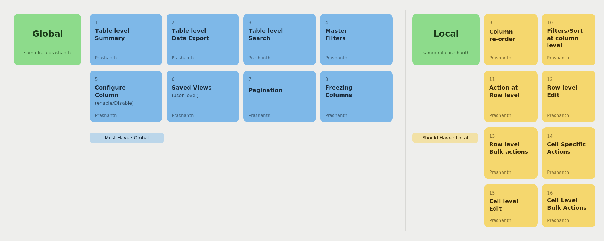
By the time the workshop wrapped, I had something I didn't have at the start: a clear, agreed scope. Not a list of visual fixes — a product brief. One composable component, built on a Global/Local model, documented well enough for teams to adopt without depending on a central design bottleneck. Here's what that component needed to be.
Six capabilities, one component. Composable for every module's needs.
Designing for reuse means designing for things you haven't seen yet
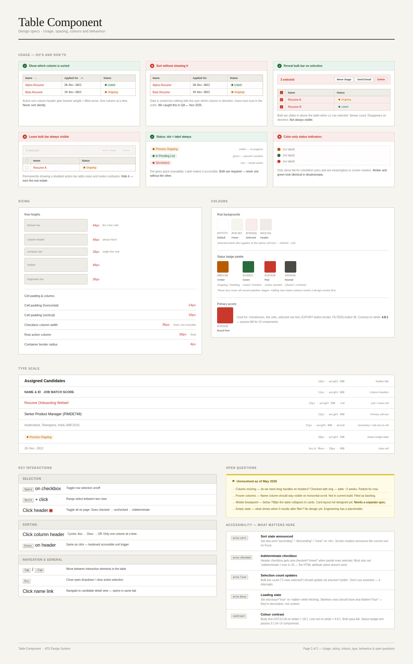
Defining the capabilities was the easier half. The harder work was in the decisions that shaped how those capabilities were built — decisions that would determine whether the component stayed useful as modules evolved, or got forked and abandoned the moment a new edge case appeared.
The output of those decisions was a fully specified component — every variant, every state, every interaction pattern documented with enough detail that an engineer could implement it, and enough rationale that a designer could extend it without guessing.
The component shipped. How teams worked changed.
Before this, every team that needed a table built their own version of it. Each sprint started with the same unanswered questions: which interactions to include, how sorting should behave, what the empty state should say. After adoption, those questions stopped being asked. Engineers stopped rebuilding. PMs stopped specifying table behaviour from scratch. Designers stopped debating patterns that had already been resolved.
The component also held. In the months following release, no team forked it — a result of the edge-case work done during design. When a new requirement surfaced, teams raised a variation request instead of shipping a workaround. That single behavioural shift — from forking to requesting — was what made the component durable.
The documentation model became the standard. Rationale-first spec writing — explaining the why alongside the what — was adopted across subsequent components. New team members could read the docs and understand not just how to use the component, but why it was designed that way. Onboarding stopped depending on tribal knowledge.
The outcomes ran across every layer of the product.
Consistency at scale, efficiency by design
- Consistent data interactions across all adopting modules
- Edge cases solved once, for all
- Reduced cognitive load for cross-module users
- Eliminated duplicate component builds across teams
- Faster implementation for new module launches
- Single source of truth for all table behaviour
- Reduced duplicate implementation effort and accelerated future product delivery
- The process became the replication template for design system components built after
- Cross-team collaboration model that outlasted the project
Small inconsistencies become large problems at scale. A five-pixel difference in table row height is invisible in a single module. Multiplied across an enterprise platform with 30 modules and thousands of daily users, it becomes the thing that makes the product feel unpolished without anyone being able to say exactly why.
Design systems work because they make the right thing the easy thing — for designers, for engineers, and eventually for users. The table component didn't just solve the table problem. The process it established — audit, anatomy, workshop, Global/Local model, documentation with rationale — became the replication template for every component Darwinbox built after it.